Headless, block-based PowerPoint alternative
Product
UI design
Design systems
Engineering
Published Dec 2022
·
✈️ 1 min read
Dex in an alternative to PowerPoint based on the three pillars:
Robust layouts that don’t break
Deep styling options
Easy storytelling through fluid slides (something I’m trying to invent)
It leverages tools like semantic design tokens, CSS grids, component libraries, and a Notion-like editing experience. It brings to presentation design the tools of web, editorial, and graphic design.
It’s a project in the planning phase. I’m currently hiring/looking for a technical partner. I haven’t written about it properly yet. Expect two very technical case studies:
Headless presentation framework: How Dex uses semantic tokens, responsive components, fluid typography, and theming to presentation design. (can’t believe nobody did it yet)
Fluid slides: How Dex will ditch the layer-model that 100% of presentation software if favor of the block model.
I’ll leave you with a few concept screens
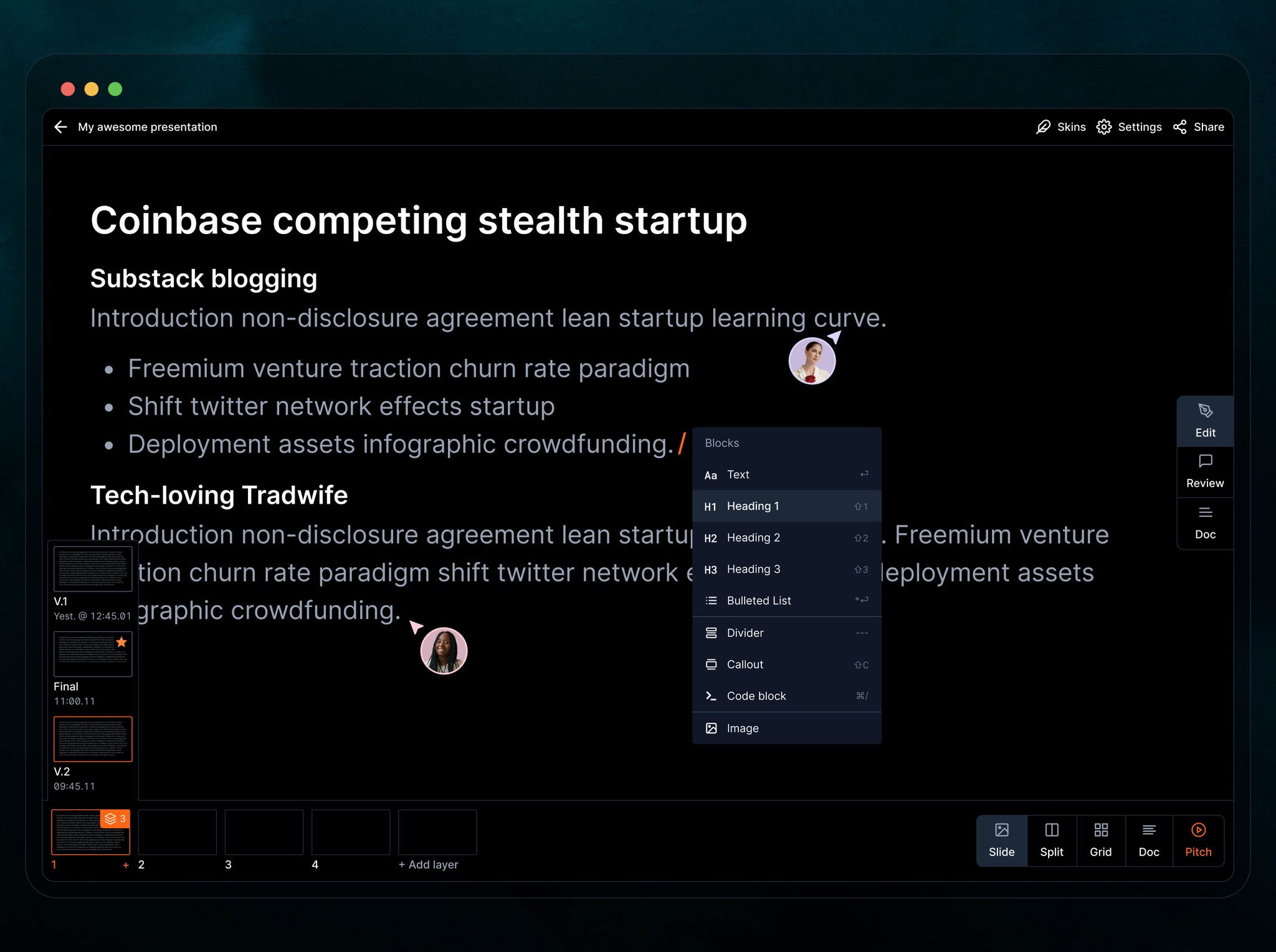
One of the interesting problems that Dex solves is versioning. The ability to catalogue the history of each slide individually is beyond useful. Another interesting addition is the Split view to compare two versions. Neither of these features is the intention of Dex and neither is validated. However, I’ve been using Powerpoint for 20 years alone and with teams of every size and I’m just using my intuition to come up with solutions. Next step is to show this to people and see what sticks
The Ability to convert a Notion page into a slide deck is how Dex Started. My insight was that you can use Titles to split pages organically. It takes some explaining, but the user will just get a perfect split every time without having to know how. All they have to do is pick from some very rudimentary choices.
Technically, PowerPoint and the likes have strong theming. But it never works. Explaining why will be the topic of one of the case studies but it’s essentially because the colors are not semantically linked to what they control (color A is used for text here and as a background in another slide). Dex solves this and makes branding infinite and unbreakable. Yes, you get to use your colors and you can’t the slides it up even if you try.
The dream is to get theming options that work like themes in Visual studio or Chrome. All themes would work on all presentations. Themes can include more than just colors. They can have spacing and layouts as well and the user won’t have to worry about breaking their slides.
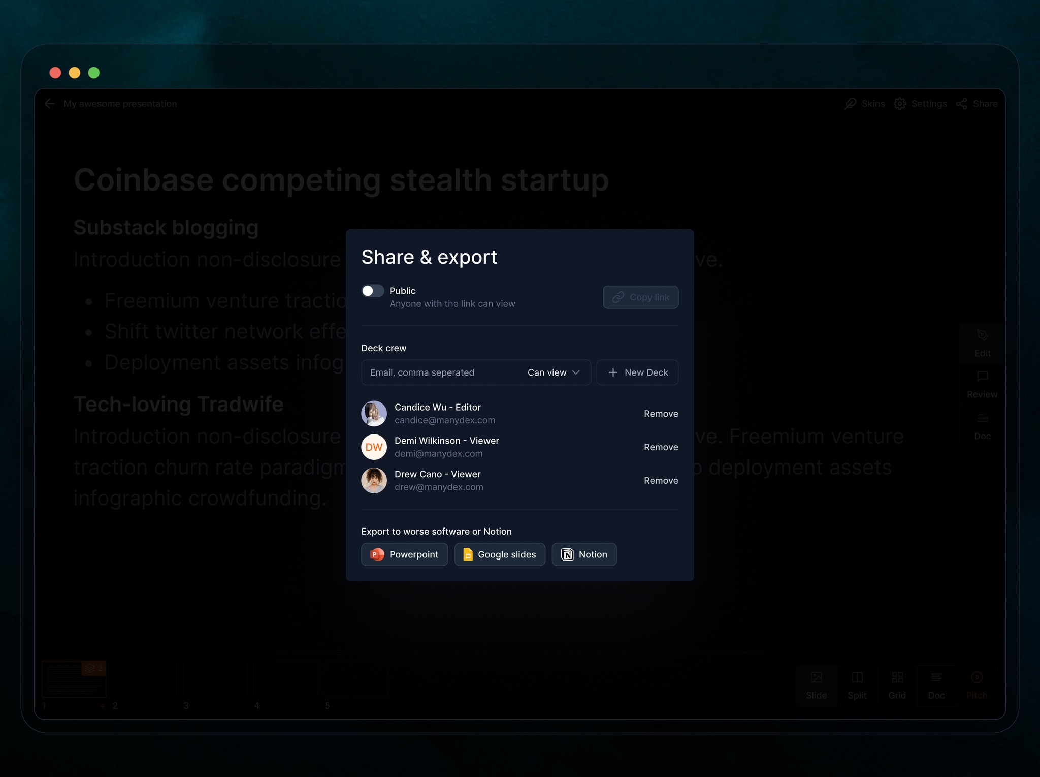
Users need PowerPoint. The idea of Dex is that it helps you build one. It can be perfectly interoperable. You can go in and out of PP depending on what you need. It could potentially replace it like Notion replaces Word for a large extent, but it can work perfectly with it as an abstraction layer on top of it because everything that can be built with blocks can be translated down to layers.


